
NABEMONO SHABU SHABU
Client NABEMONO
Services
Product Branding Identity,
Commercial Space
“ 我們家每週都會吃火鍋,這種家人圍在一起的感覺是我選擇做小火鍋的原因。We strive to be more than just a shabu-shabu restaurant—we want to be your go-to home-away-from-home for a heartwarming meal that feels home-cooked and tastes chef-prepared.”
—Founder Jessica Loan
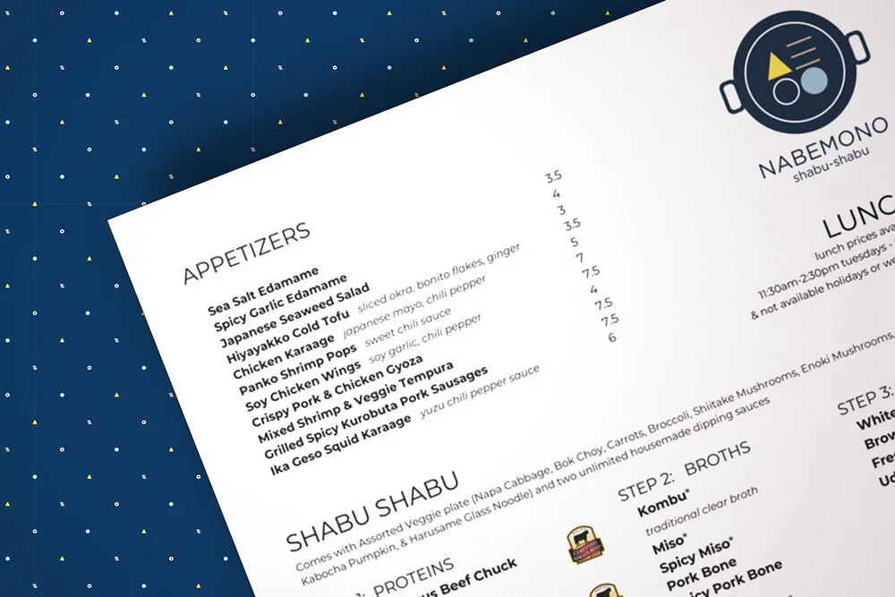
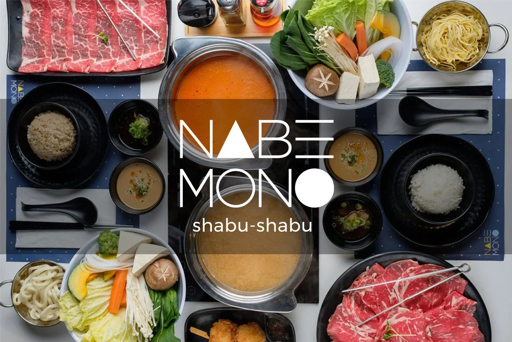
NABEMONO Shabu - Shabu 日式小火鍋
NABEMONO Shabu-Shabu 品牌靈感來自創辦人 Jessica 對家庭火鍋聚會的熱愛。「NABEMONO」取自日文鍋物,名稱簡單好記。HUEMON Design 將火鍋食材融入字體設計,如 A 代表豆腐、O 代表白蘿蔔,讓標誌宛如在鍋中跳動。品牌主色選用中性藍色,展現 Jessica 的親和個性,並延伸至招牌、制服與空間設計。NABEMONO 不只是餐廳,更希望成為顧客的第二個家,提供溫暖卻專業的用餐體驗。
NABEMONO Shabu-Shabu was inspired by founder Jessica’s love for family hot pot gatherings. The name, taken from the Japanese word for “hot pot,” is simple and memorable. HUEMON Design created a playful logo by turning the letter A into tofu and O into radish, bringing the design to life as if boiling in a pot. A modern blue palette reflects Jessica’s warm personality and extends across signage, uniforms, and interiors. More than a restaurant, NABEMONO offers a home-like dining experience with chef-level quality, combining branding and culture to build customer trust and loyalty.